

The tutorial was born from my audience asking how I created the bubble effect for London Lettering project. Prior to executing in Photoshop, I searched a tonne on “how to create a bubble effect” which I used as a foundation to create my own, personalised version using techniques I’ve learned over the years.
With no tutorials currently out there for this particular Photoshop effect (I google searched, heh) this is a great opportunity to share techniques and methods I currently use to produce the final illustration you see. I plan to take you through my illustration process so you can achieve typographic illustration that shines.
All right, let’s get right to it.
1. Research

It’s not impossible to start illustrating without research, but it sure is a huge benefit to align what’s in your mind with visual examples. I collated my images into a mood board and have this board printed out, or open in a separate window. As this is a “faux” effect, having realistic versions of the effect you’re trying to achieve will aid the process. In this case, I grabbed real bubble examples to understand how light is reflected/refracted and always referencing these images in case you start wondering “ugh, something’s not looking right”
2. Create a Lettering Sketch
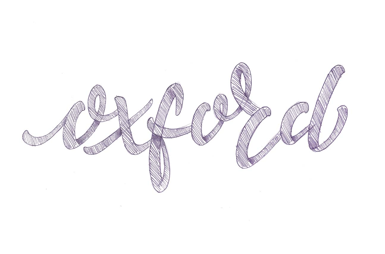
This tutorial assumes you have a lettering piece or type at hand to apply the effect to. I used a pencil first to create a “skeleton” identifying composition, balance and spacing. Then applying “thickness” to the letters to create a puffy/bubble style. I would go through 2-3 sketch refinements before importing the lettering into Illustrator.
If you’re sharing the process feedback can help improve the design! I had fellow creatives provide their thoughts when I shared the initial sketches on Instagram, which was really useful as they could spot a minor mistake or bring a fresh perspective.
I can definitely create a tutorial on how to build your letterforms, if you’re interested let me know on Twitter!
I do have one tip on this stage to emphasise the bubble effect you’ll create. This involves a basic understanding of shape, which luckily I won’t go into right now.
To emphasise the intended effect, use round terminals, thicker weights and a bouncy baseline in your lettering piece. Your letters should “float” just like a bubbly bubble. Connecting certain letters (maybe not all) can also add the effect of a natural looking piece.
3. Vectorise in Illustrator

Place your sketch into Illustrator and lower the opacity so you can see the points you’re about to create.
Vectorising your lettering allows for more flexibility as well as the ability to scale at to any size without losing quality. Your best friend, the pen tool will assist you here. Start plotting points and ensure your curves are silky smooth!
At this stage you’d want to let the lettering sit on it’s own. I vectored the first version and returned a few days later to further refine. This “step away” period is essential to my process because guaranteed, there is always a curve that needs paying attention to and some kerning adjusting. Just like the sketch process, I typically go through 2-3 more refinements until I’m satisfied with the result.
4. Bubble Effect
What you really came here for.
Now, I must disclose the digits I use for this typographic illustration may differ for you and will require experimenting until you meet your desired result. To achieve something similar to mine, my Photoshop document size is A4 at 300dpi.
Where you could potentially lose the effect is the overuse of layer styles. The trick is to be modest in how each layer style is applied. Some digital illustrations have an amateur-ish feel because a layer style was just applied with not much consideration on the entire result.
4.1 Import Background Image and Apply Layer Mask

I’d recommend taking your own photos! A lot of creatives grab images from the net without understanding images have copyright and or licensing. So always check, or simply take your own.
You want to reveal parts of the background selectively. Areas that are already well-lit and revealed in a certain direction. In my example, the revealing is at a diagonal.
Apply a mask layer. Fill mask with all black. Use soft brush tool with varying opacity and “paint” using white.
4.2 Import Vector and Reduce Layer Fill to 0%

This will make the lettering “disappear” which will make way for your layer styles in the next step.
4.3 Apply Layer Styles
Here is where we’ll create the faux-bubble effect. In hindsight, I realised I didn’t have to use all the effects that I list here. You can go really simple or use all the effects. The idea is to experiment and get comfortable knowing what each layer style will achieve. Here, I wanted this bubble to have a blue tint (to match the background) so we’ll be using light blues to create the glows. So open up your layer style window and apply the following!
Inner Glow

Inner Shadow

Bevel and Emboss

Satin

Gradient Overlay (Optional)

Outer Glow (Optional)

5. Add Depth By Masking Shadows
Depending how you imported the vector version, you’ll notice the lettering is flat which is not what I wanted. To recreate the feeling of the letters being in front or behind each other, apply a mask layer with a brush opacity of around 30% and begin to erase areas that require a shadow.
Don’t worry about the applied layer styles going all weird! Just add or continue to erase while changing brush opacity until you get the right tone.

6. Enhance the Effects Using White Highlights and Glows
The next set of effects will really start bring the typographic piece alive, creating a bright, coloured result. Duplicate your main lettering, clear all effects, drop fill to 0% and apply the following layer styles:
White Rim Light

White Soft Brush Highlights
You’d want to add these next set of highlights selectively. For the white brush glows, add white particularly along the circumference of your letterforms or where your letters overlap. You can also adjust the opacity of your white layer so certain areas are not as strong.

Coloured Glows


Using Photoshop’s soft brush again, choose two colours from your background image that will used to highlight parts of the lettering. You still want to be selective and careful where you add these soft glows. Add colour to areas that you want to appear closer to the viewer, as well as areas where light from the background image may hit the letters.
If your glows aren’t bright as you’d like, change your layer’s blending mode. I particularly used using “linear dodge” with 70% opacity for these set of coloured glows. Just remember to adjust accordingly while not overpowering the other applied effects.
Coloured Glow Strings

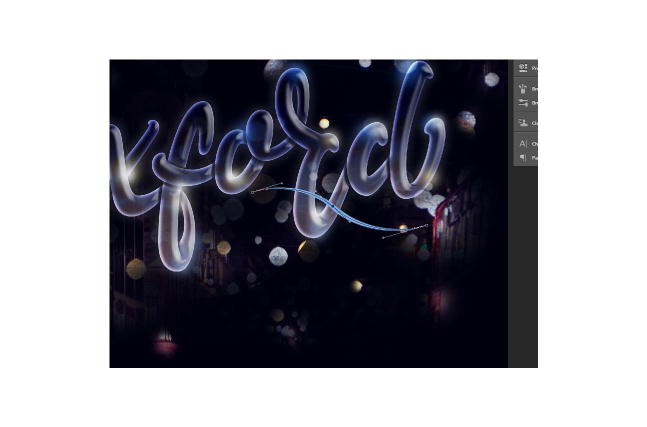


These light streaks are added to further enhance the piece and add a sense of movement. Typically light streaks or light trails are captured when a photographer’s drops the camera’s shutter speed but here I’ve created my own. I even gave them my own name—light strings or as I’ve titled here, glow strings!
My version to create this effect is really basic and you will find much more advanced methods out there. I’ll run you through the method I used.
- Select the pen tool and create a path similar to the path in the image. Oh and make sure this is on a new layer!
- Select the brush tool and you’d need to go into the brush settings and ensure “shape dynamics” and the control is set to “pen pressure”
- Pick your colour (one you’ve already been using for coherence) and select the pen tool again
- Right click (with the pen tool selected) and click stroke path. A window will appear and make sure to turn tick “simulate pressure”. Hit OK.
- Your path will simulate the brush settings you currently have and the path you initially created.
- Now experiment with different paths, colours, brush sizes and changing your layer's blend mode to linear dodge or colour dodge to achieve the effect you want!
7. Apply the Faux Effect to Your Secondary Word

I wanted the secondary words to appear more rounded. So a nice tip if you’re not able to achieve a “circular” result during the sketching stage is to use the elliptical marquee tool and create a circle just a little bigger than the letter. Go to filter, distort and use “spherize”, move amount slider to 100 and hit ok. You can definitely play around here, the position of circle will affect the spherical distortion. Not 100% needed but it adds another level of perspective to the letters to appear closer looking to a circle bubble.
Alright, because you’ve done the hard work creating the main faux-bubble effect, simply copy the layer style of the original lettering and “paste” layer style onto the secondary letters.
You may notice the effect is too strong or just plain weird. Go into the layer style settings and adjust the digits until you achieve the right result. I even removed some of the applied layer styles so these words don’t conflict or compete with the main lettering.
Similar to the main lettering, make use of your soft brush tool again and paint onto the areas you want highlighted using a combination of white and coloured glows.
8. Create Bubbles Around the Secondary Word

Here you will create more artificial bubbles. There’s a reason why the background was created the way it is. Adding these bubbles brings the illustration together.
There’s a couple ways to do this:
- Use your soft brush tool and click (if you’re using a mouse) to create a circular glow
- Copy layer style of the faux-bubble effect and adjust the layer style settings
- Use circular marquee tool and apply a white inner glow
Whatever method you choose, duplicate your shapes around the piece while adjusting the scale to create variety. Remember not to overdo the bubbles so you don’t drown the secondary word.
Also if you haven’t taken a break. I suggest you take one and come back to the piece later with fresh eyes!
9. Final Adjustments and Publish
There’s a few handy adjustment layers you can make use of to give your typographic illustration and almost any illustration you create in Photoshop that sharpness, punch and publish-ready look. For this particular illustration I used:
Levels
Move the black slider a tad to the right and bring the white slider to the left to make the lights even brighter. Contrast is key and you’d want to make the lights lighter and the darks, darker. Sometimes the levels adjustment is all you need! Adjust until satisfied.
Gradient Fill – Linear
Apply a linear white gradient with an angle of 90 degrees to the lower third of the illustration. Then change the blending mode to colour dodge. This will bring some life into this section of the illustration.
Gradient Fill – Radial
I use this gradient fill to bring the piece together and add a cinematic feel. Use a dark blue/dark purple in the centre of the illustration then change blending mode to soft light. You can increase or decrease the scale of the gradient depending on how much you want this effect to be apparent.
See the illustration come to life in the time-lapse video below!
FIN!
You’ve done the hard work, now showcase your creation.
Don’t think it’s perfect? Showcase anyway. There’s no loss in sharing the final result because if your goal is to be paid to create, then you need to showcase the work you want to be paid for. You will only get better with each final piece and for sure, my next type-based tutorial will be better and much more refined!
But hey, I appreciate you for reaching the end! It was awesome writing this tutorial and being able to share this effect with you.
If this was useful, let me know by tweeting me (@jaytenart) and saying hi! Or you can share the tutorial using the link above.
See you in the next one.